I’ve long been a fan of Anki as a general purpose tool for learning new concepts. Michael Nielsen has a good overview of using Anki to augment long-term memory.
Despite it being useful free software overall, Anki’s UI is not its strong point. I find the default font size for cards is too small and dislike the lack of clear visual differentiation between questions and answers.
I recently discovered that the Anki card templating system is HTML and CSS-based, and thus fairly straightforward to create custom styles for cards.
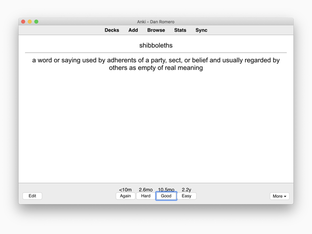
Since most of the deck content is text, I was able to leverage the text-focused design of this site for a quick improvement for the legibility and aesthetics of my Anki cards. It turned a default card from something like this…

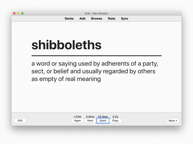
…into something like this:

Improvements include: larger font size, improved typeface in San Francisco, left-aligned text for longer, multiline answers, off-white background, and subtle improvements to the visual weight of the <hr> tag.
Below are instructions for how to set this up for yourself. The sample deck in the the example is 100% text-based. You could easily modify the design to incorporate images (just another class or <span>).
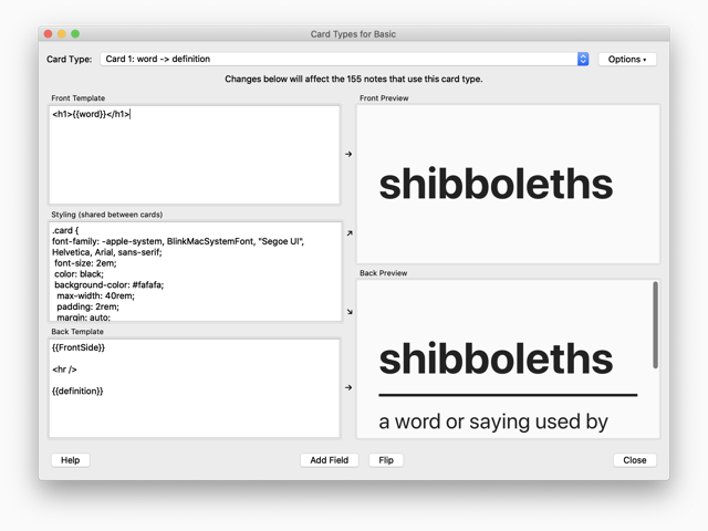
Study Now button.Edit button.Cards... button.Card Types window.
In the front template section, I used an <h1> wrapped around the word field for the front of the card.2
<h1>{{word}}</h1>
For the styling section, I used the following CSS.
.card {
 font-family: -apple-system, BlinkMacSystemFont, Helvetica, Arial, sans-serif;
 font-size: 2em;
 background-color: #fafafa;
 max-width: 40rem;
 padding: 2rem;
 margin: auto;
 color: #222;
 }
And for the back template, I repeated the word field and separated it from the definition field by an <hr>.
{{FrontSide}}

<hr />

{{definition}}
First published on February 19, 2020